Brand
House of
How Heathens looks, sounds, and names things. A reference for anyone designing, writing, or making something with Heathens, and a press kit at the bottom.
Jump to downloads ↓Who it is for
For anyone who has been shamed for being themselves while leaving crossed out: a cult…
I mean religion :P
Heathens is a lifestyle brand for people leaving a high-demand religion, Mormonism first. It takes the things that once carried shame, the garments, the guilt, the vocabulary, and turns them into something you can laugh at, wear, and wash with.
Voice
In on the joke.
Insider vocabulary
Write for people who know the words: magical underwear, terrestrial undies, your telestial soul, the honest seeker of truth, “loud laughter.” The joke lands because the reader grew up with it.
Irreverent, never cruel
The target is the shame, not the people. Every product is a kindness dressed as a punchline: a stopover, a wash, a laugh.
The wink
Sentences end with a wink when they have earned one: ;) and :P. A struck-through word is part of the voice: “you are in a cult, I mean high-demand religion.”
Plain about the product
After the joke, the facts: fabric, weight, sourcing, traceability, and how made-to-order works. Honest about what the product is and is not.
“For anyone who has been shamed for being themselves while leaving a cult… I mean religion :P”
“Hey, we may be Heathens but we are also good to the planet ;)”
“It probably won’t help much but we hope it brings a lot of “loud laughter” back into your life ;)”
Naming
- The house
House of Heathens
The full name, used on the brand guide and in the copyright line.
- The brand
Heathens
Always plural and capitalized in the wordmark. A single person is a Heathen.
- Garments
Classic Garments
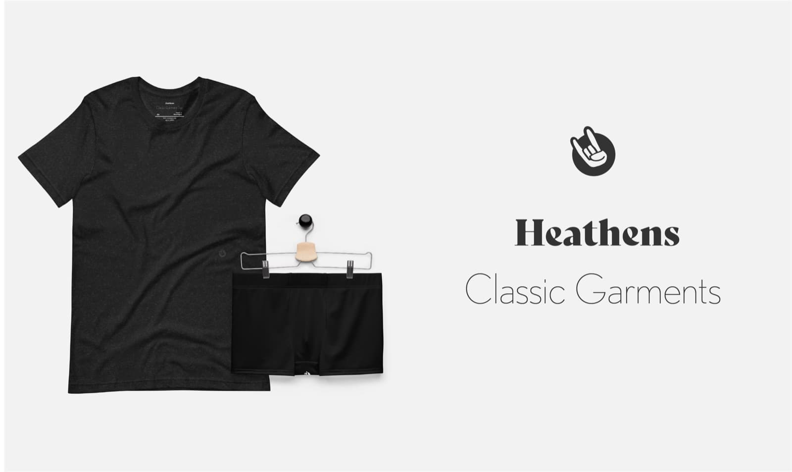
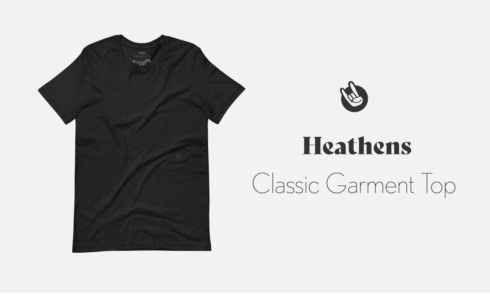
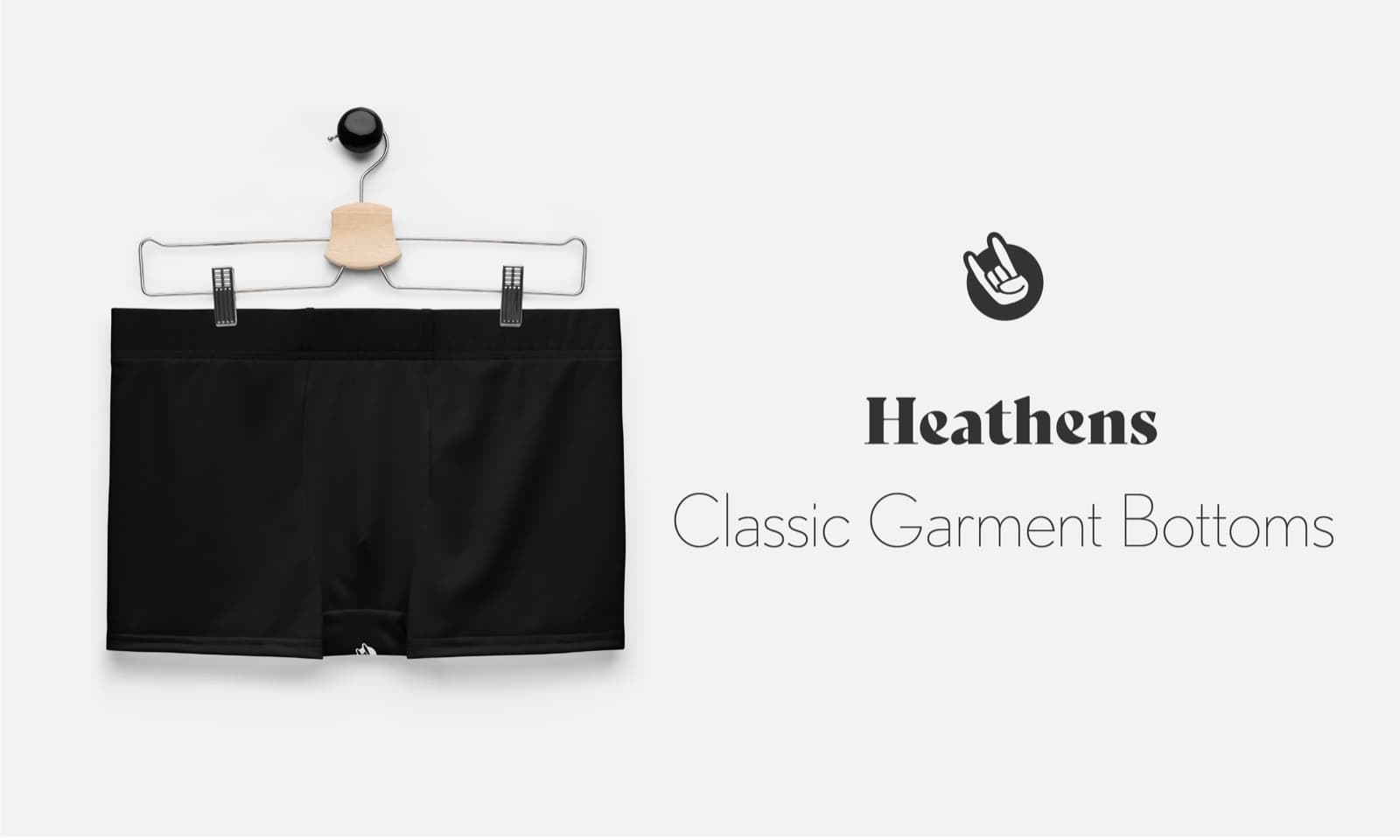
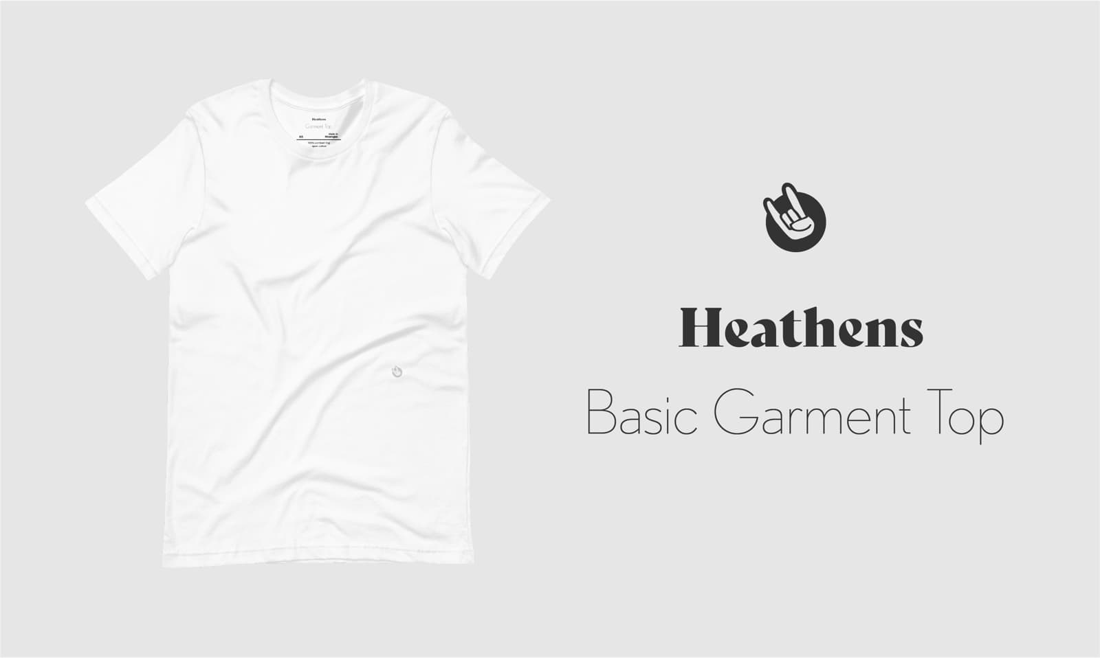
The underwear line. Classic Garment Top, Classic Garment Bottoms, Basic Garment Top.
- Goods
Soap · Tote Bag · Guide To Leaving Mormonism
Named for what they are. The joke lives in the copy, not the product name.
Logo
A wordmark and a sign.
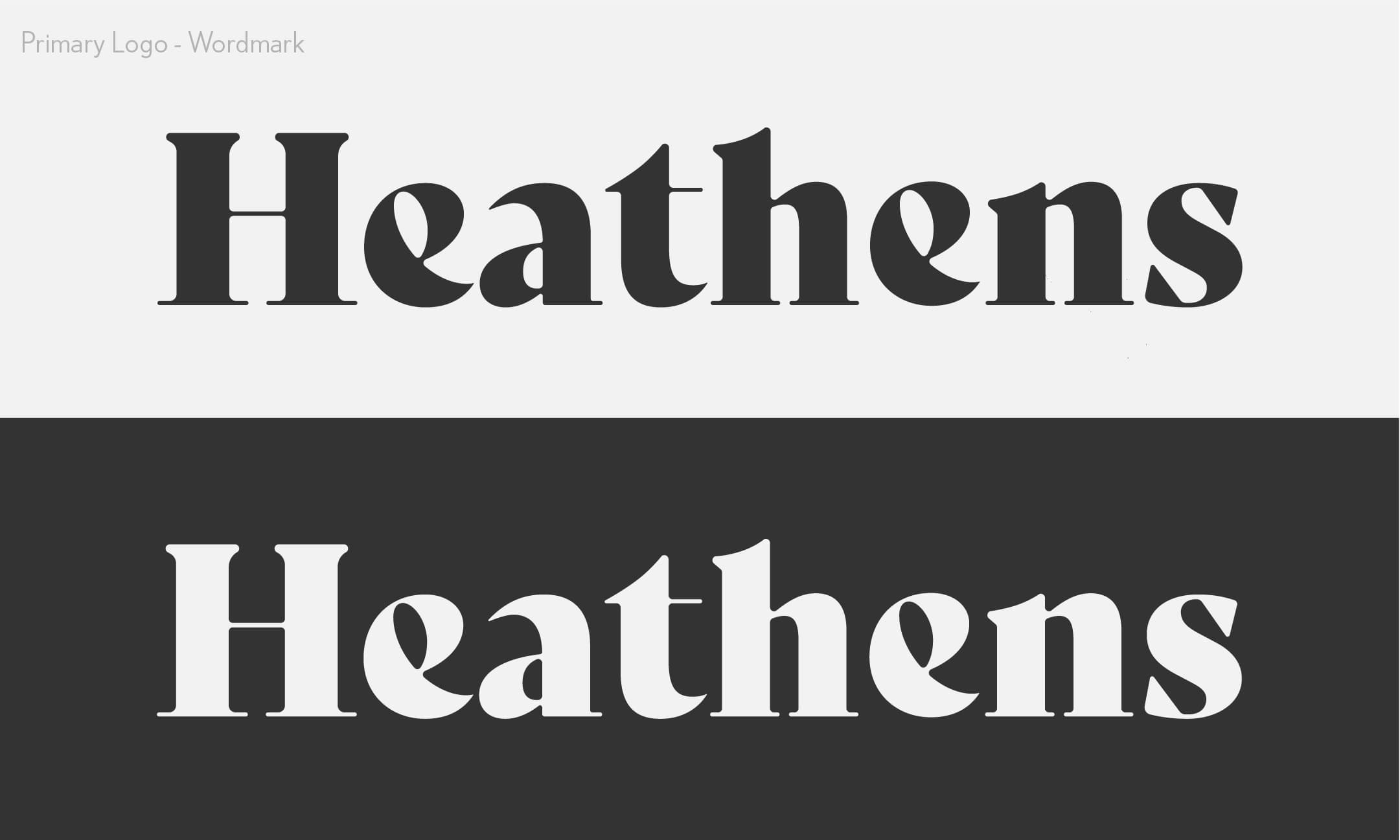
Primary logo · Wordmark
The wordmark is drawn, not typed: a heavy, high-contrast display serif with teardrop counters. Use the artwork; never set “Heathens” in a font to imitate it. Dark on light, or light on dark.
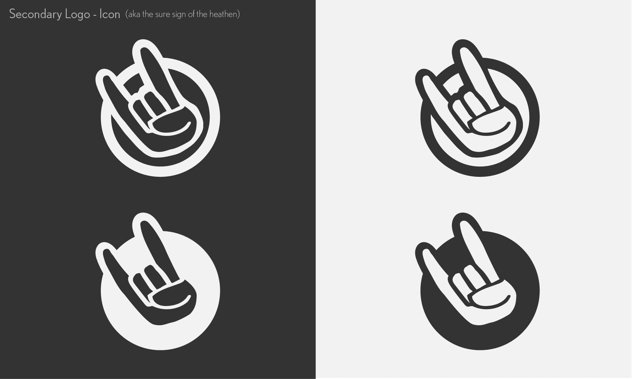
Secondary logo · Icon
We refer to it as “the sure sign of the heathen.”
The horns hand over a disc. It signs the garments at the hem, the tote above the wordmark, and anywhere the wordmark would be too wide. The hand is cut out of the disc, so the ground shows through.
The original guide also shows the icon as an outlined ring; both forms are below in the 2023 guide.
Pride
Proud to be a Heathen.
For the pride collection the icon takes on the rainbow: six bands, purple through red, on a slant, inside its dark outline. Use these for pride pieces only, so they stay special.


Color
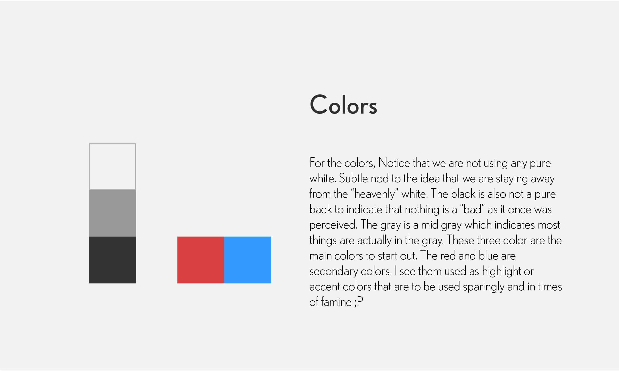
Nothing is pure, and that is the point.
“Notice that we are not using any pure white. Subtle nod to the idea that we are staying away from the “heavenly” white.”
Grounds and text
Always slightly off-white. Never pure white: we stay away from the “heavenly” white.
Where most things actually live.
Text, the hero, the buttons, the footer. Taken from the original tiled-wordmark banner. Not pure black: nothing is as “bad” as it once was perceived, not even outer darkness.
Signature and pops
The accent. The guide’s red, a touch richer: the banner, the struck-through word, button hovers, the Sale tag. A little sin goes a long way.
The pop: the yellow band from the rainbow icon. The hero’s punchline and the footer icon, on dark grounds only. Jesus wanted us for a sunbeam; we became the highlight instead.
The names are the joke: outer darkness, the coffee, the tea, the sin. The 2023 guide’s blue is retired; its red became Sin. Sin is the accent, not the ground ;P
Use sparingly, or in times of famine ;P
A warm, rich brown, and against the Word of Wisdom. A treat, not a habit.
The rainbow
- Sin#C43A3F
- Fry Sauce#E78651
- Sunbeam#EFC743
- Green Tea#71C89E
- Jesus Tears#346BBD
- Kolob#4B1D63
The six bands of the rainbow icon, for pride pieces and anything rainbow. The red band is Sin and the yellow band is Sunbeam, so the rainbow and the signature colors stay one family.
Type
Round, modern, easy to read.
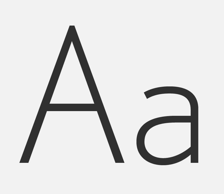
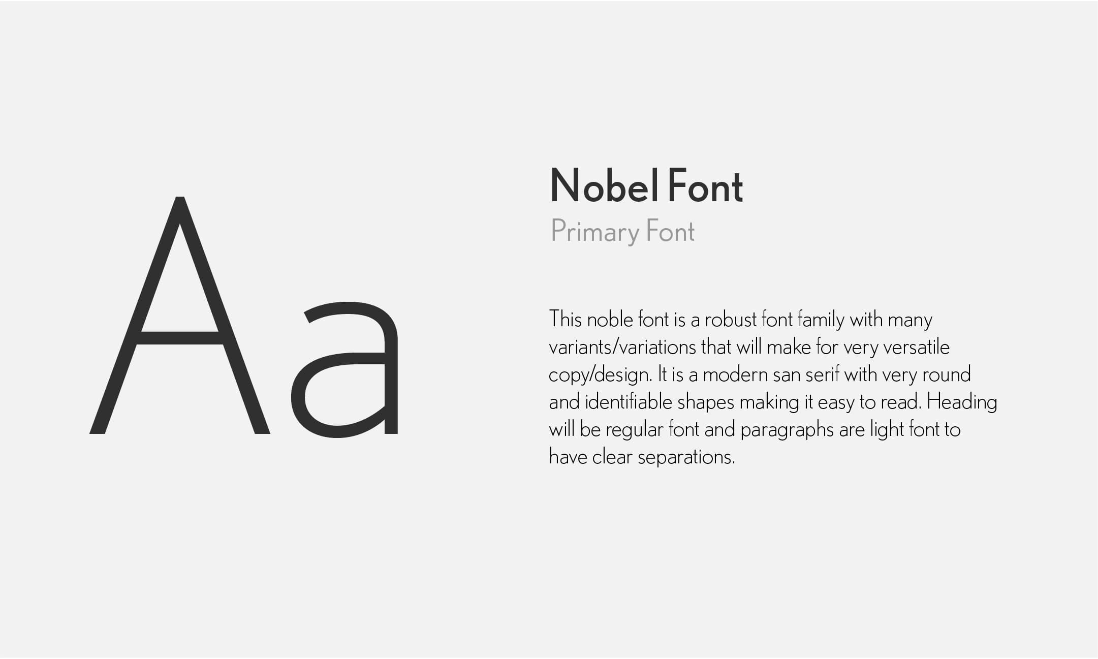
Nobel
Primary font
A robust family with many weights, a modern sans serif with very round and identifiable shapes that make it easy to read. Headings are set in regular, paragraphs in light, for clear separation.
Poppins
On the web
The website is set in Poppins, a free geometric sans with the same round shapes, used the same way: regular for headings, light for paragraphs. Nobel stays the face for print, labels, and packaging.
Headings are regular.
Paragraphs are light, so the two separate cleanly without a change of face.
Labels and packaging
The joke is on the inside.
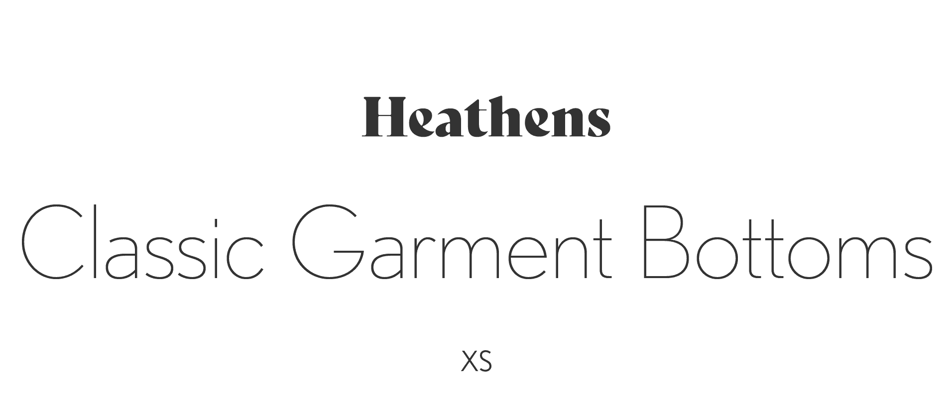
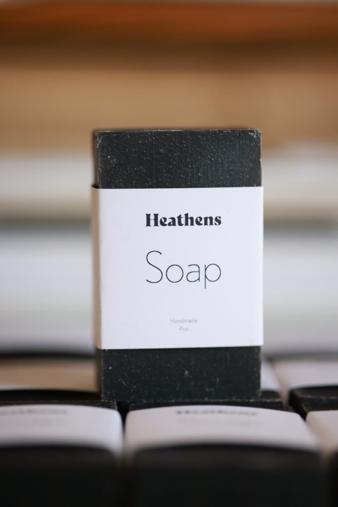
Garment labels are printed inside the neck and waistband: the wordmark, the product name in light type, then size, origin, and fabric under a hairline. The soap wears a plain white band with the same wordmark-over-name lockup.

In use
Product cards.
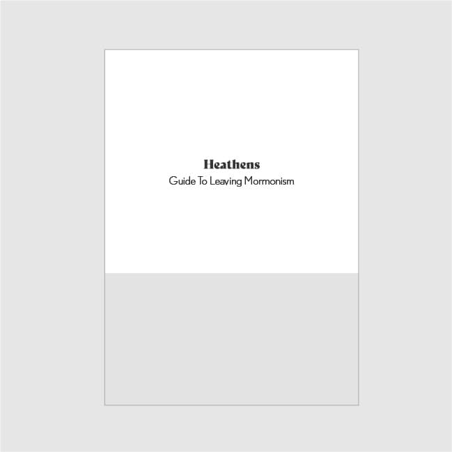
Launch images pair the product on the light ground with the icon, the wordmark, and the product name in light type.
The original guide
House of Heathens Branding Guide, 2023.
Downloads
Press kit.
The marks as artwork. Use them as they are: do not redraw, recolor outside the palette, stretch, or set the name in another font.